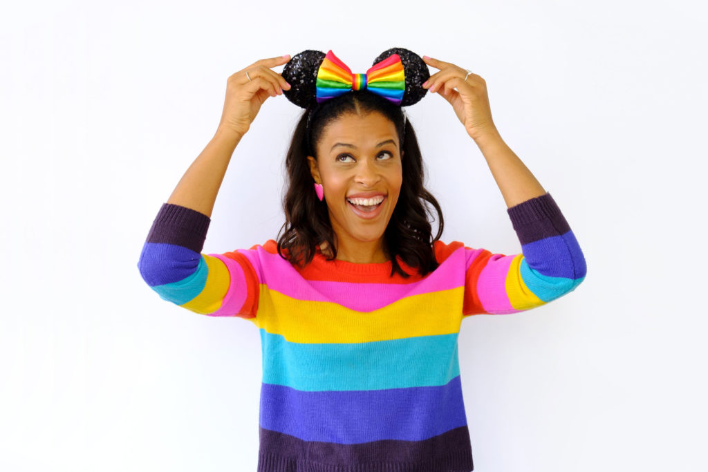
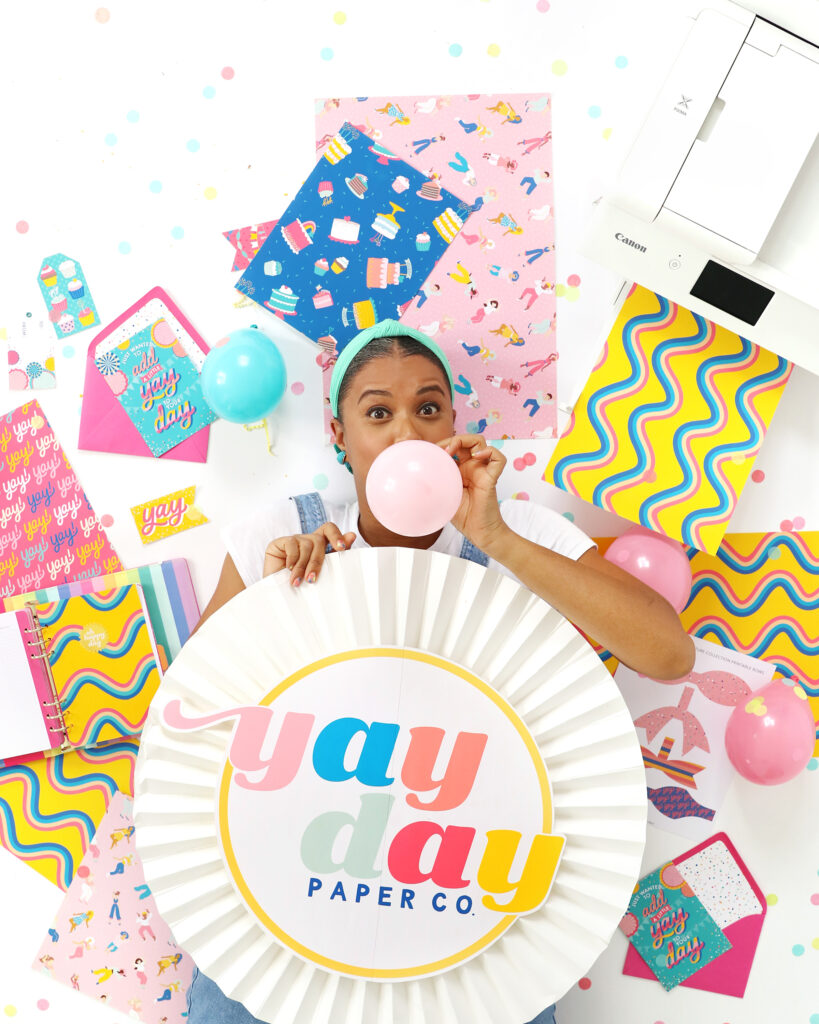
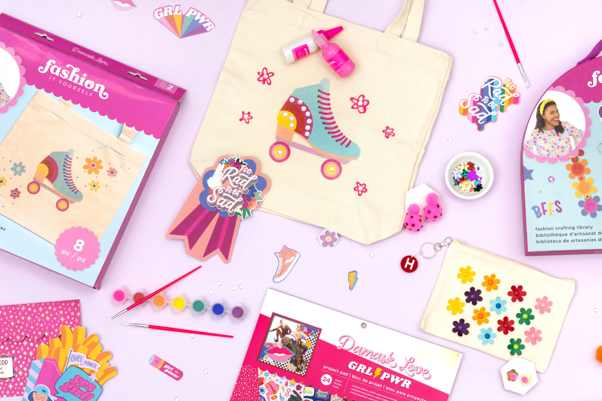
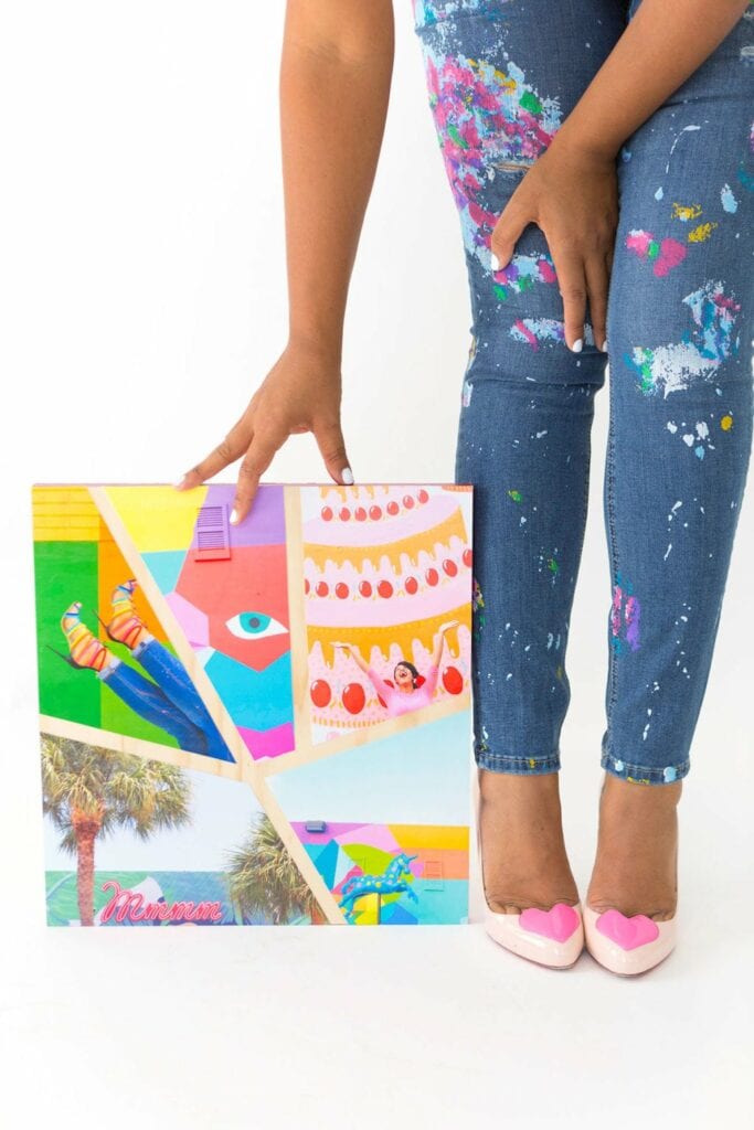
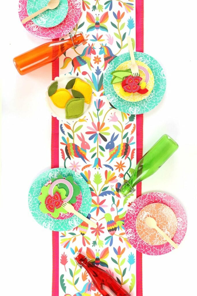
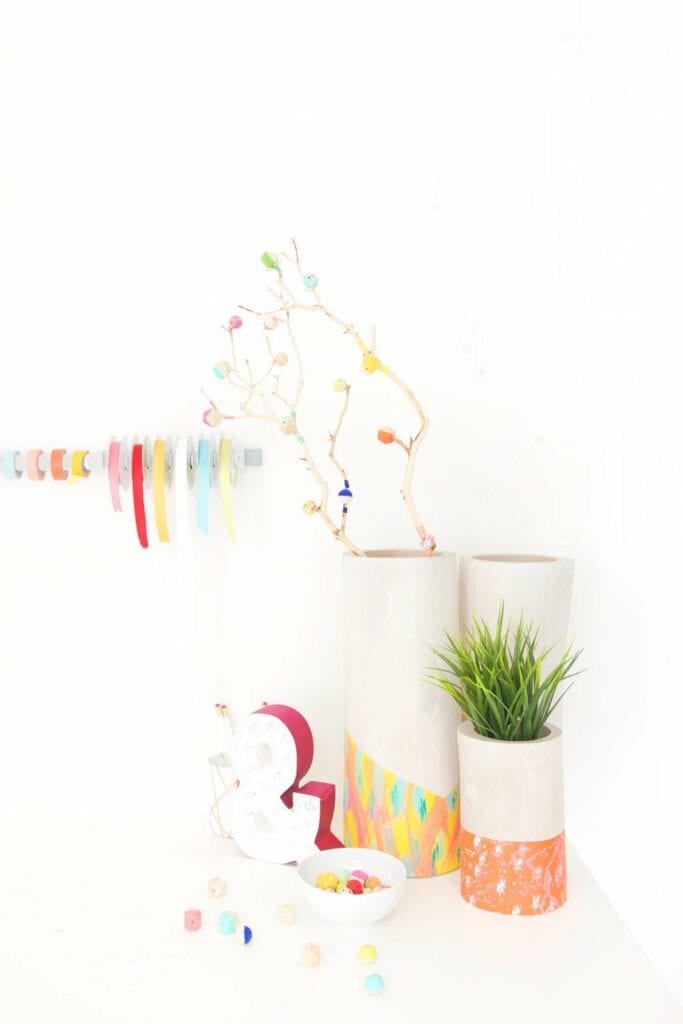
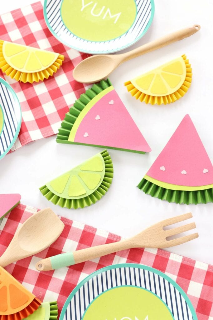
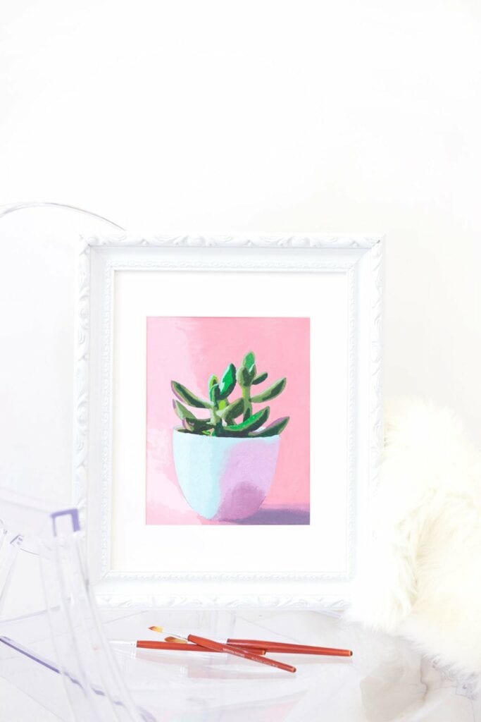
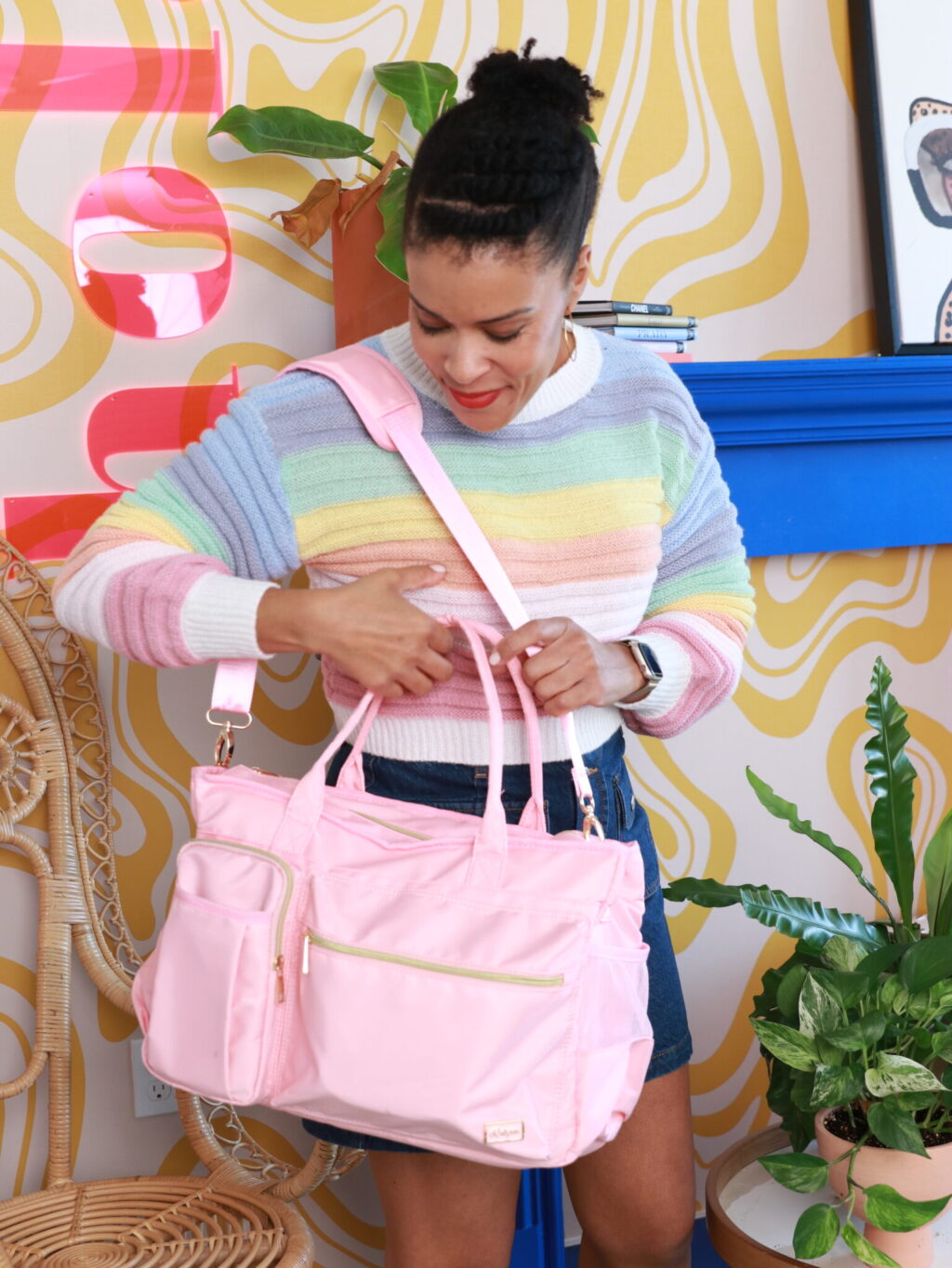
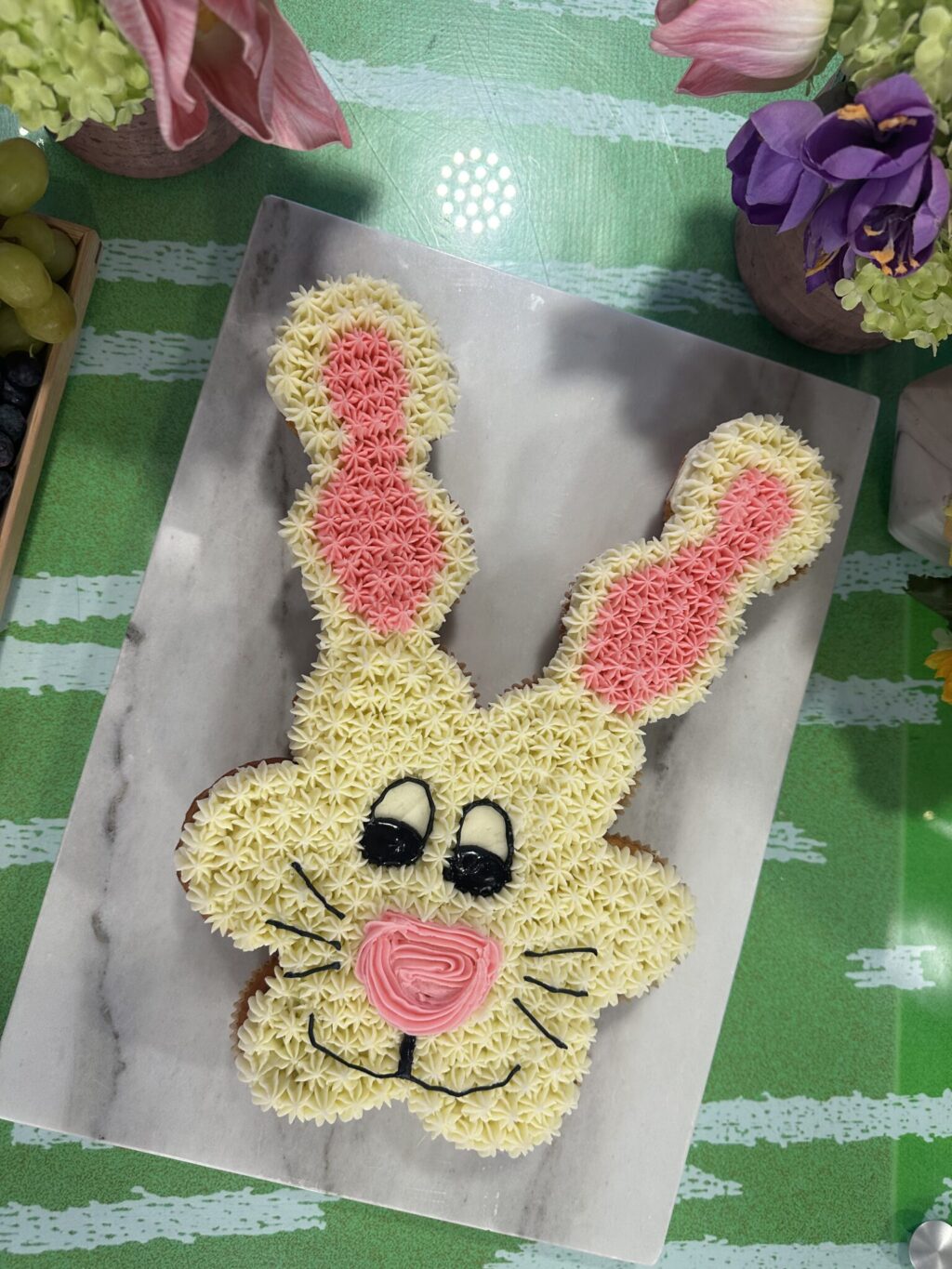
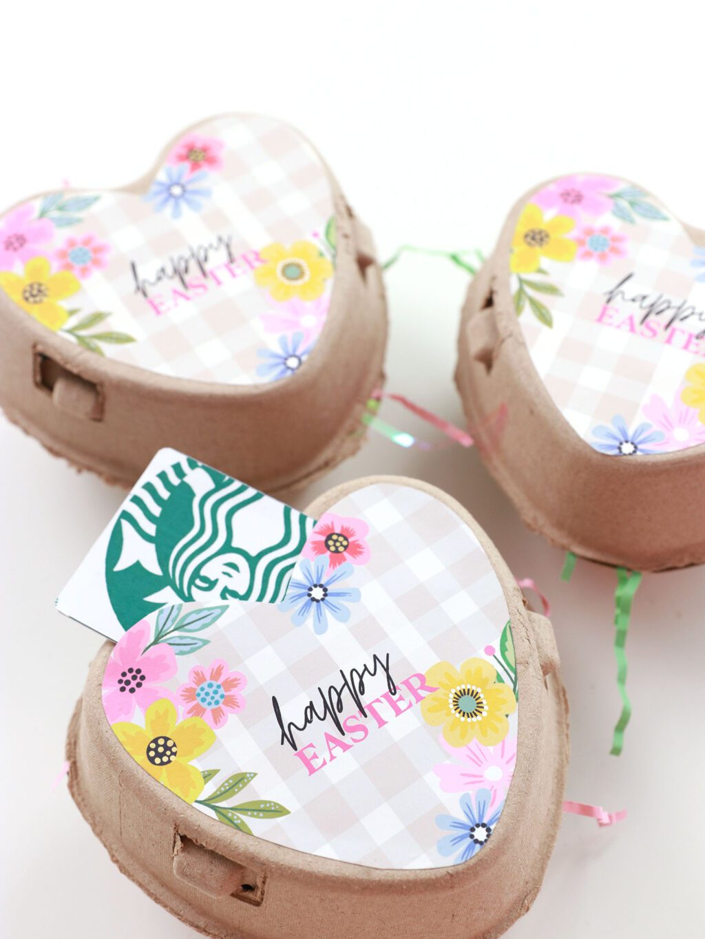
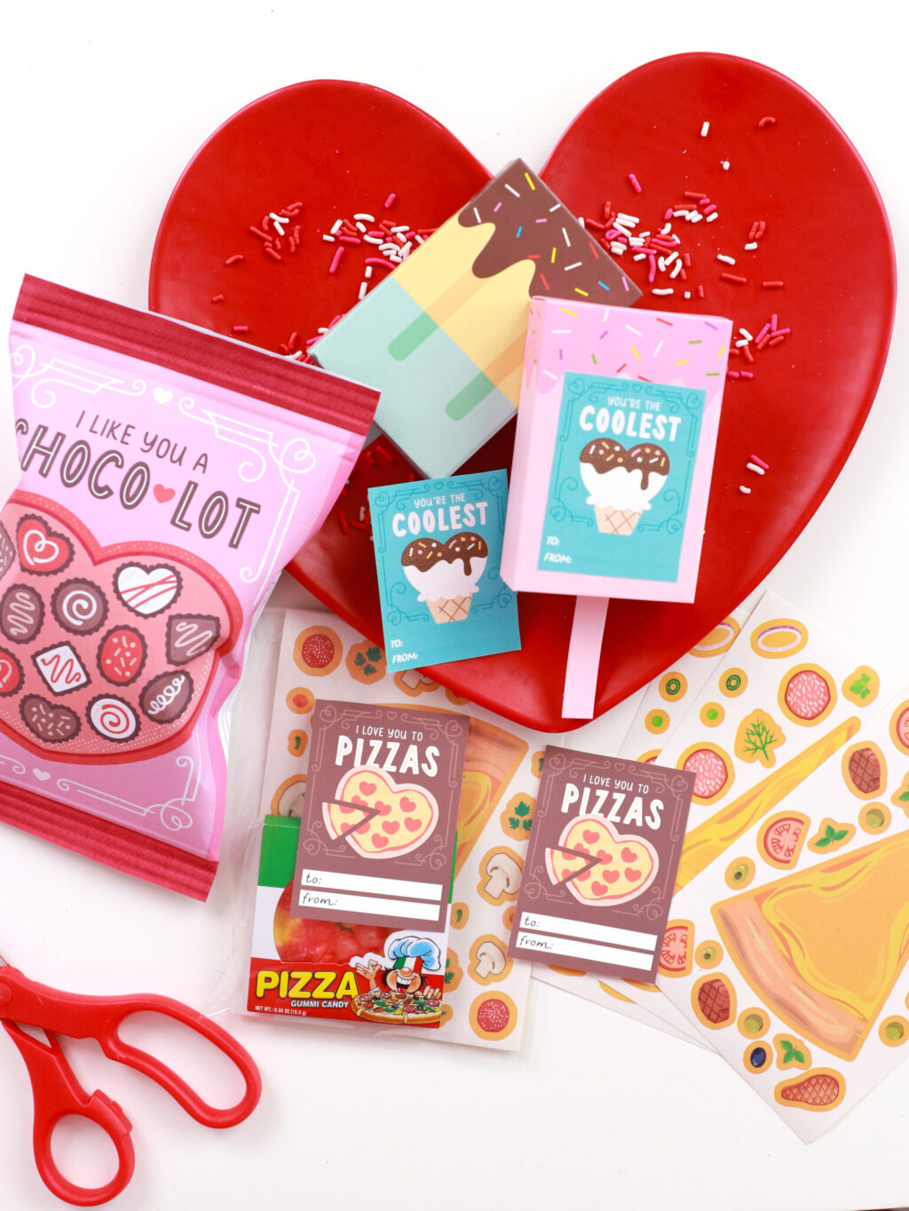
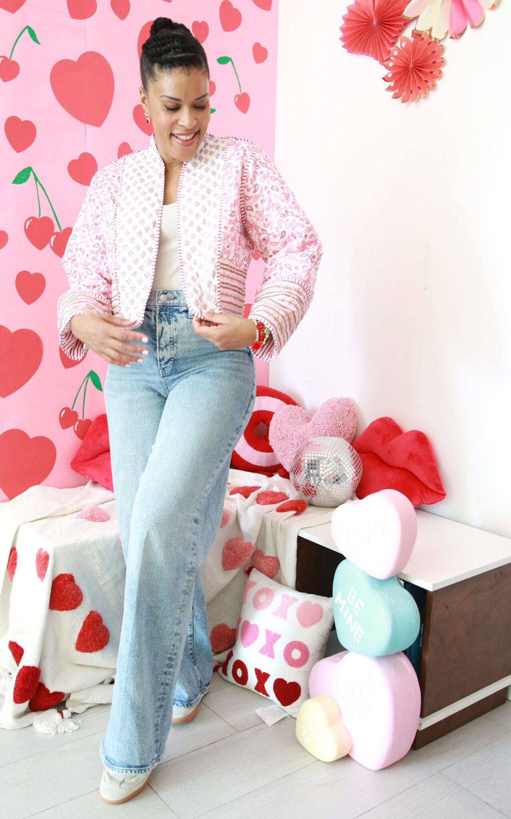
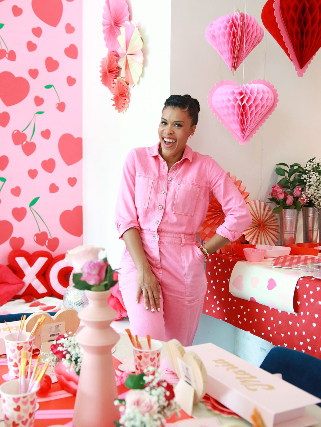
Corral The Chaos: Magnetic Embellishment Board

Corral the Chaos: Magnetic Embellishment Board | Damask Love Blog


If there is one thing I know it is this: If you wander around Home Depot for long enough, inspiration will strike. It’s guaranteed.

Confession: I much prefer an afternoon at Home Depot than an afternoon in a craft store. There is something about all the potential of those raw materials. I spent a good fifteen minutes perusing the stove vents to see what I can come up with. I got nothing on that one…but I did come up with this project which is exactly what I need for my overflowing collection of embellishments.

Corral the Chaos: Magnetic Embellishment Board | Damask Love Blog

{1} Wiss  MetalMaster Snips: Okay – now I know you may not have these one hand, but they really are a great tool for paper crafters.  I first showed them to you in THIS post where I used them to cut apart my dies. They cut through most thin to medium weight metals with no problem.

{2} 12 x12 picture frame. You can find this at Michael’s or any other craft store.

{3} 12 x 12 Metal Sheet - you may wanna ask someone to point you in the direction of the metal sheets. In my Home Depot, they were tucked away on an aisle endcap.

{4} Decorative Aluminum Sheet. I opted for the Mosaic Pattern Aluminum Sheet. The sheets come in a 12 x 24 size, which is the smallest size available. This part of the project is completely optional, but I really like the decorative accent that it adds to the finished product. Since this aluminum sheet is not magnetic, it is a purely decorative top layer. The steel sheet in step #3 is what makes the board magnetic

Corral the Chaos: Magnetic Embellishment Board | Damask Love Blog


{5} To organize your embellishments, you’ll need some containers and these Clear Top Tins from Specialty Bottle are perfect. They are available in several sizes, but these three are likely the ones that will be most useful for your embellie board project. For this particular board, I used the smallest of the sizes pictured here.

Corral the Chaos: Magnetic Embellishment Board | Damask Love Blog


{6} Last, you’ll need magnets. You’ll need rather strong magnets since they will need to work through the top sheet of decorative aluminum. These Flexible Magnets are available at Michael’s and work perfectly.


Corral the Chaos: Magnetic Embellishment Board | Damask Love Blog

{1} Use your metal snips to cut the decorative sheet. If you would rather not purchase the snips, many of the employees at Home Depot carry a pair and if you ask nicely, they may just let you use them on site to cut through your sheet. I would just suggest that you arrive at the Home Depot with the frame you’ll be using. This way you can be sure that it fits the metal sheet once you’ve cut it.

{2} Trim the decorative aluminum down to the same 12×12 size as the steel sheet.

{3} Place two magnets on the back of each clear top tin. No need for any adhesive. Just put them there and they’ll stay in place. I prefer two magnets rather than one to ensure a better grip and to be sure that the container doesn’t spin around.

{4} Fill up your containers, place the metal sheets in the frame and stick the tins into place!

Corral the Chaos: Magnetic Embellishment Board | Damask Love Blog

Corral the Chaos: Magnetic Embellishment Board | Damask Love Blog Corral the Chaos: Magnetic Embellishment Board | Damask Love Blog

The nice thing about this project is that one sheet of the decorative aluminum can make two frames. I also like that storage solutions like this force me to limit my hoarding. If I only have nine of eighteen tins to fill, then that’s what I can keep. I can live without the rest, and I’ll be much happier with the decrease in clutter. After all, I’m pretty sure the floor is not intended to be one big shelf, right?!

How do you organize your embellishments?

Corral the Chaos: Magnetic Embellishment Board | Damask Love Blog


Crafter’s Course on Color: Hues, Tints & Shades

ColorwheelHeader

Have you ever been curious about strategies for combing color? How to get out of the color rut? Have you ever been told that when it comes color & design, “You’ll just…“know” when it’s right.” Yeah…ummm…go ahead and file that under “Statements That Are Not Helpful.”

Now, I do think that there comes a point when you get comfortable with color and develop a “knack” for knowing when things are well combined. That doesn’t  mean that we all have to sit around waiting for the color fairy to anoint us with magical design powers.  After doing a fair bit of  reading on interior design and art, I think there are plenty of tips, strategies and theories that can be super useful for us paper crafters and DIY-ers.

I am far, far………far from an expert on design, but I have attended the University of Google and I have read ten too many issues of House Beautiful and BHG. I’ve learned lots, so I thought I’d share.

Over the next month (and maybe more) – I’ll be posting lessons on color for crafters. There will be projects, tutorials and lots and lots of resources for you to file away .

Today, we’re gonna talk about the all mighty color wheel and the differences in the terms, “hue,” “tint” and “shade.” It’s interesting stuff …or maybe I’m just a nerd. Either way, I hope you enjoy!

The Crafter's Color Wheel: Hues | Damask Love

{1} Clear & Simple Stamps Say Yellow to Your Fans {2} Amuse Papaya {3} Amuse Orange {4} Amuse Poppy {5} Amuse Cherry {6} Amuse Berry {7} Amuse Grape {8} Clear & Simple Stamps Purple Crushed Velvet {9} Clear & Simple Stamps Your Style Blue Me Away {10} Amuse Mermaid {11} Clear & Simple Stamps Emerald Bling {12} Amuse Wasabi

Subheader-Title-ImageThere’s Hefner, there’s Grant…and then there are inkpads. We’re gonna talk about the latter of these “hues.” A few week’s ago, I used the terms “hue” “tint” and “shade” interchangeably. I thought they all were synonyms for “color.” Welp – it turns out that in the world of design & artsy people, these words have very different meanings.

“Hue” refers to the traditional color wheel as we know it…the rainbow. Twelve hues make up the color wheel, including the three primary colors: red, blue and yellow.

CraftersPerspective

In the world of paper crafting & DIY – “hues” are very common. The bold, heavily saturated look of these colors is perfect for creating cheerful cards and party decor. For interior designers, an entire room of hues might create a jarring environment…luckily we crafters don’t have to worry about that! Cards and other paper crafts are small and can be packed with color. Use the entire spectrum if you’d like – or just select a few (more on how to select colors will be coming up in a later post!)

From-Theory-to-Practice

All this theory is great, but how does it work in practice? Here’s a quick & simple card that I created with hues.

The Crafter's Color Wheel: Hues | Damask LoveBright and bold is my favorite look, so this ikat card is right up my alley! Most of the cards and crafts I create feature bright hues.

SUPPLIES:

Papertrey Ink Irresistibly Ikat | Papertrey Ink Inside & Out: Thank You | Amuse Berry Ink | Amuse Orange Ink | Amuse Grass

The Crafter's Color Wheel: Tints | Damask Love Blog{1} Amuse Lemon Whip {2} Amuse Buttercup {3} Clear & Simple Stamps Creamsicle Cardigan (2nd generation impression) {4} Amuse Apricot {5} Amuse Watermelon {6}Amuse Berry (2nd generation impression) {7} Amuse Heather {8} Amuse Colbalt (2nd generation impression) {9} Amuse Sky {10} Amuse Ocean (2nd generation impression) {11} Amuse Pistachio {12} Amuse Lime

TintDefinedAdding white to any of the hues in the color wheel creates a “tint.” In most cases, “tint” is synonymous with “pastel”, but this may depend on how much white is added to the hue. If only a teeny bit of white is added, the color may still appear quite vibrant.

CraftersPerspectiveUnless you use paint or other mixed media in your crafting, it’s unlikely that you’ll come across many opportunities to mix your own colors to create pastels. For paper crafters like you and me, pastel inks are easy to find and a great way to add soft tints to your project. Another way to create a pastel shade is to use a second generation impression of your ink. For example, a vibrant orange hue becomes a pastel color if you first stamp off the page and use the second generation impression in your project.

For me, pastels are great for soft feminine projects or for creating a springtime feel.
From-Theory-to-Practice

The Crafter's Color Wheel: Tints | Damask LoveThis simple card features a soft pastel ombre that I created using Faber-Castell Gelatos. They blend beautifully! This layout and pastel color scheme is a perfect feminine stationery. Sidenote: I am obsessed with these gelatos. I want to paint my walls with gelatos!

SUPPLIES:

Faber-Castell Gelatos Gift Set | Papertrey Ink Headline Alphabet | Paper Presentation Ginger Cardstock 

The Crafter's Color Wheel: Shades | Damask Love{1} Amuse Saffron {2} Clear & Simple Stamps Golden Tiara {3} Clear & Simple Stamps Orange you Fabulous {4} Clear & Simple Stamps Rouge Ruffles {5} Clear & Simple Stamps Maroon Maven {6} Amuse Currant {7} Clear & Simple Stamps Purplicious {8} Clear & Simple Stamps Purple Crushed Velvet {9} Amuse Navy {10} Amuse Eucalyptus {11} Clear & Simple Stamps Kraft Like a Rockstar Green {12} Amuse Fern

Shade-Defined

“Shades” are basically the opposite of “tints.” Shades are created by adding black to any of the twelve hues in the original color wheel.

CraftersPerspective

“Shades” are probably my least frequently used colors. Even when stamping out the above color wheel, I noticed that several of these inks were unused!  At first, “shades” seemed a bit “dingy” to me, but after thinking about it more they are perfect for a wide range of projects. Choosing a few shades from this color wheel can create very masculine projects, which is something that I struggle with. Shades are also great for autumn themes.

From-Theory-to-Practice

The Crafter's Color Wheel: Shades | Damask LoveEven delicate images like these feathers can become masculine when stamped using “shades” rather than “pastels.”  I’m sure you can image how the feeling of this entire card would change if created with soft “tints.” For me, the “shade” color wheel is super helpful for tackling masculine projects that are often so difficult.

SUPPLIES:

Studio Calico Oh Snap! | Studio Calico Frame & Feathers | Amuse Fern | Amuse Eucalyptus | Clear & Simple Stamps Orange You Fabulous

ExtraCreditReading

Interested in a few more samples that show today’s  ”lesson” in action?  Here we go:

  • Perhaps my most favorite use of hues…ever!  
  • Bold teal and yellow make this a fabulous sample of hues in action.
  • I love the simple layout! 
  • This paper crafted wreath is so well executed and the the pastel color palette is so pretty.
  • Debby Hughes of Limedoodle blog does such a great job with shades on this card.
  • Add pastels to your next gift with this simple idea.
  • {DID YOU KNOW?} Damask Love now has a “Cardstock & Ink Photo Library” where I will be posting photo samples of some of my favorite color collections! I’ll update it over time so keep checking back. Today, I’ve updated the library with a photos of the A Muse Studio ink collection. Just click the graphic on the sidebar.

Did you make it through?!  When it comes to colors, do you have a “go-to” color wheel? Which of these color wheels best represents your own style and preference?

Welcome May Sponsors & Affiliates

Welcome May Sponsors & Affiliates | Damask Love Blog

Before we get into all the fun content I have in store for you, howsabout a little love for all the May sponsors! If you have a blog, shop or company and would like to get the attention of some awesomely crafty people, just contact me! We’ll make it happen!

Sponsors-Post-Format PaperPresentationClear and Simple Stamps Sponsor | Damask Love BlogEllen Hutson Affiliates | Damask Love BlogLifestyle Crafts Sponsor | Damask Love BlogScrapbook Adhesives Sponsor | Damask Love BlogPaper Source Affiliate | Damask Love Blog


*Ellen Hutson, Lifestyle Crafts & Paper-Source represent affiliate partnerships. Purchases made through links on Damask Love may result in my receiving a small commission. These are all brands that I am proud to represent, as I truly believe in the quality of their product

Damask Love Sponsor Faves Pinterest Board


Style Watch: Cinco de Mayo Inspired

Clear and Simple Stamps Style Watch: Cinco De Mayo Inspired | Damask Love Blog

I get very excited about Cinco de Mayo. The food. The bold colors. The music. It gets me pretty ramped up. Or maybe it’s the huge pitcher of sangria that gets me ramped up. Either way, I’m in the mood for a fiesta.

Today, I’m taking some of the quintessential components of Cinco de Mayo and translating them into a few party-worthy projects that you can use year-round.

Clear and Simple Stamps Style Watch: Cinco De Mayo Inspired | Damask Love Blog


Oh…my beloved mason jars. How do I love thee! And I love thee so much more when thee are filled to the brim with wine and decorated with tassels.

For this Cinco de Mayo inspired ensemble, I created a color coordinated trio of projects starting with the tissue tassels on each jar. They are the perfect amount of sass for these little jars.

Clear and Simple Stamps Style Watch: Cinco De Mayo Inspired | Damask Love Blog


Clear and Simple Stamps Style Watch: Cinco De Mayo Inspired | Damask Love Blog

And of course you’ll need something to sip from, right? This is where the Favor Flags dies come in handy! Of course you can stamp them with fun sentiments using By the Glass Sentiments stamp set, or…

Clear and Simple Stamps Style Watch: Cinco De Mayo Inspired | Damask Love Blog

The final piece of my ensemble is probably my favorite. Papel picado is a traditional decoration for Cinco de Mayo, but unless you already have a die for this, creating a banner of “perforated paper” can be a tad time consuming. By using my Doily die, I created the illusion of perforations.

Clear and Simple Stamps Style Watch: Cinco De Mayo Inspired | Damask Love Blog

Clear and Simple Stamps Style Watch: Cinco De Mayo Inspired | Damask Love Blog

SUPPLIES:

By The Glass Sentiments | Favor Flags Dies | Favor Flags | Doily Die


A Crafter’s Course On Color

A Crafter's Course on Color


I’m always cooking up something new. Something I hope will be fun and informative. Last month we tackled monograms and starting next week I’ll be talking about color.

Over the last few month’s I’ve gotten a lot of questions about “color.” How to combine them, which inks coordinate with which cardstock, who has the perfect shade of “grey?”

Throughout the month of May we’ll be exploring the world of colorful crafting. We’ll be getting down to the nitty gritty of color theory and how it applies to crafting. We’ll explore the color collections of several companies and talk about how you can match colors across brands…and all along the way, I’ll bring you projects that I hope will inspire you and avoid the “color rut” that can challenge every crafty person.

For now, I’d love to know what  ”color questions and comments” you have? Are there particular difficulties you’ve had? Do you have brands that you want to know more about? Are there products that pique your interest? Let me know!

Can’t wait to get started and here what you think!

Have an awesome Friday!